Airstream: Crunchbutter & Mountaintop Milk
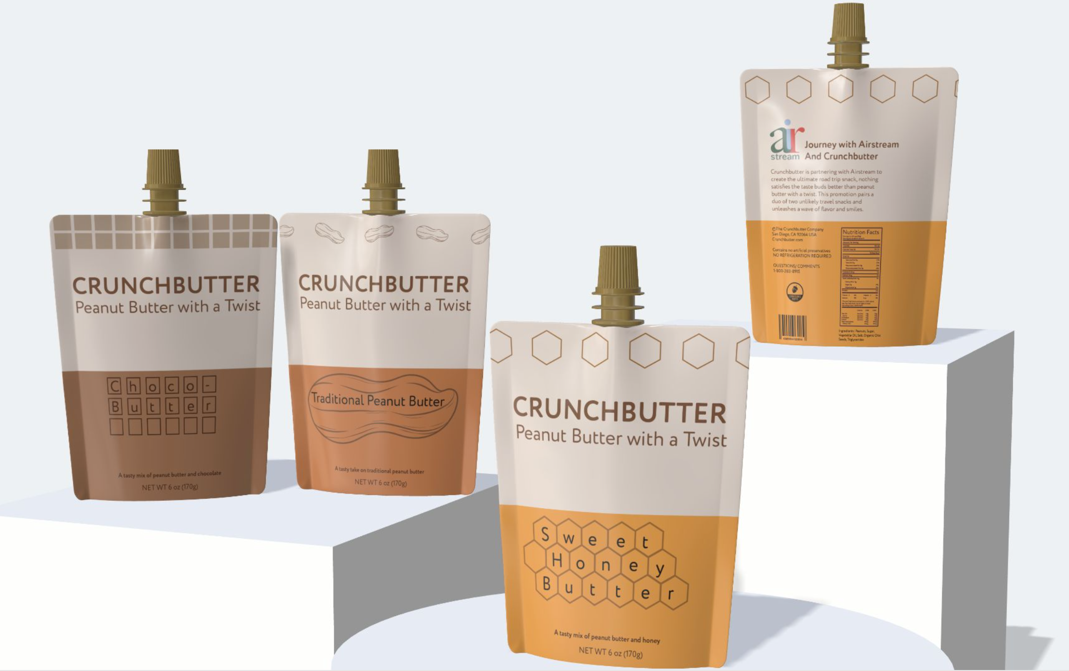
This project was a collaboration with Airstream to rebrand their logo, and create a food and beverage package they could promote with their campers, as well as sell in stores to take out on the go. The re-brand was something Airstream needed in order to feel more family oriented and camping vibes.
First I raised the bar on the “a” and lowered the bar on the “r” so they are more fluid throughout the logo, as well as enlarging “stream” so that “air” sits flush on top. I then made the height of the “i” and “r” the same so they also sit flush with one another. The next part was choosing colors that would fit the outdoor, adventure seeking ideals, so I chose a nature pallet and placed it throughout the new logo. The tail of the “a” sitting in front of the “i” and “r” made it feel cozy and nested together, I felt that it really brought the new logo together.
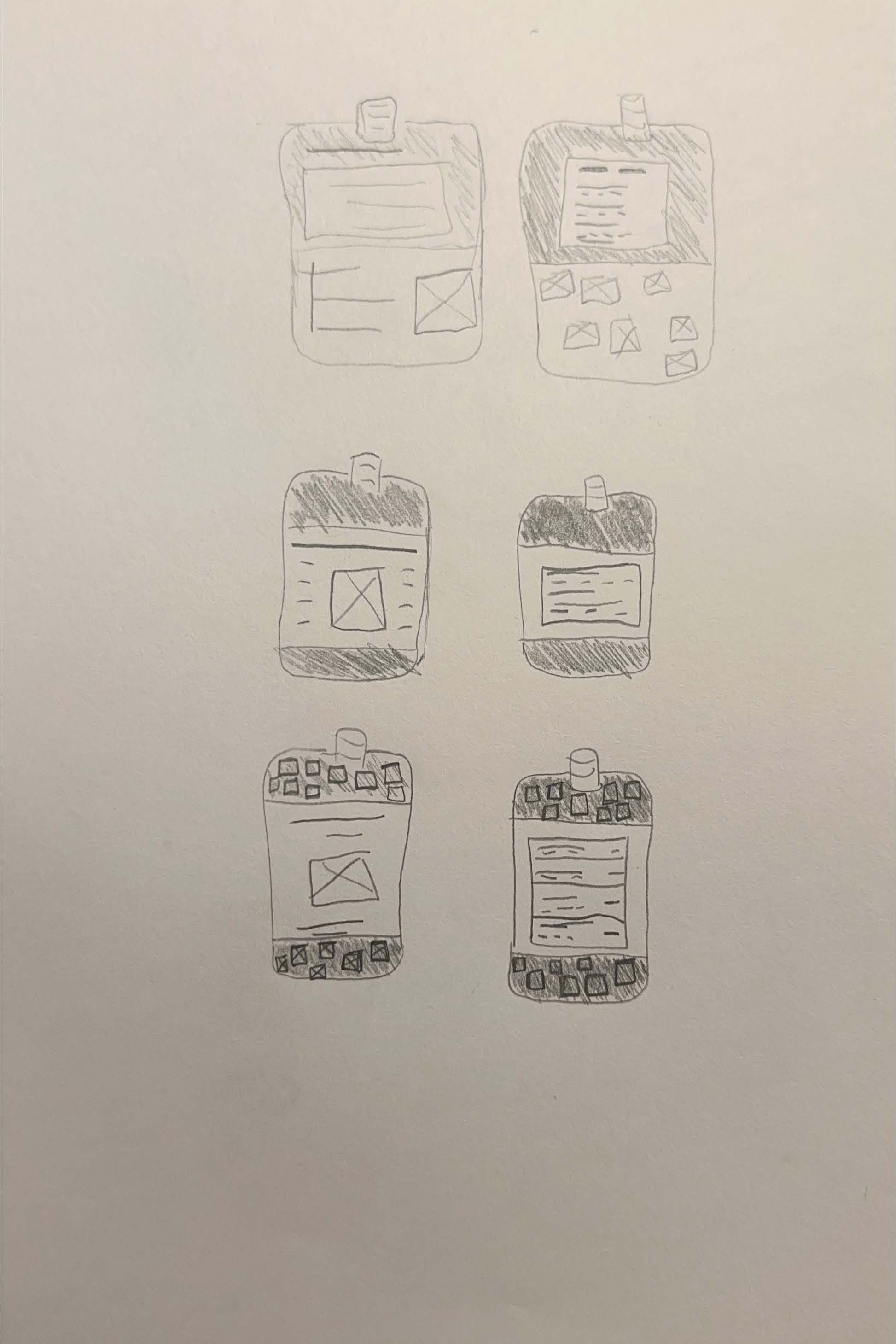
CrunchButter Sketches
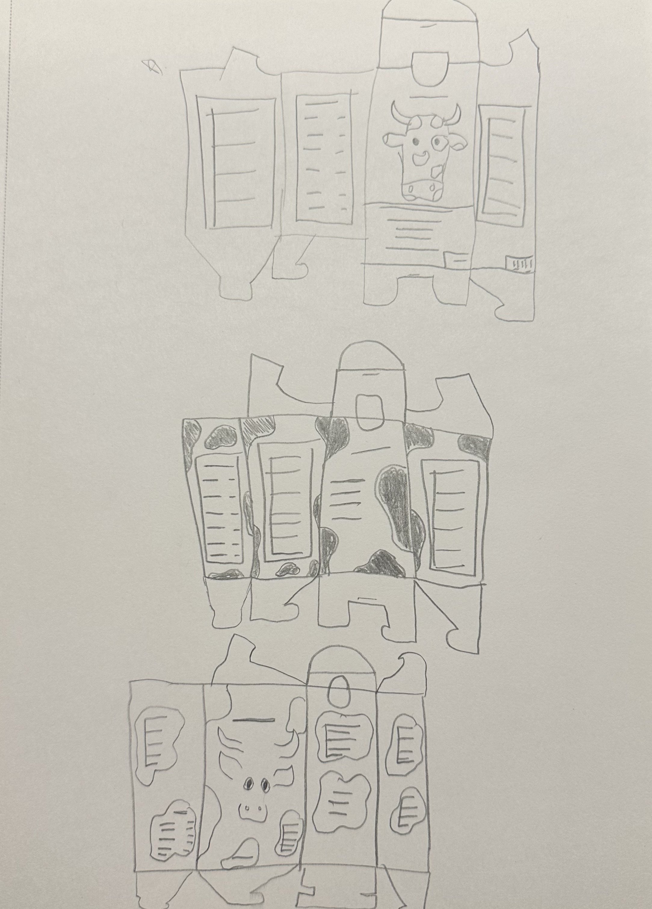
Mountaintop Milk Sketches
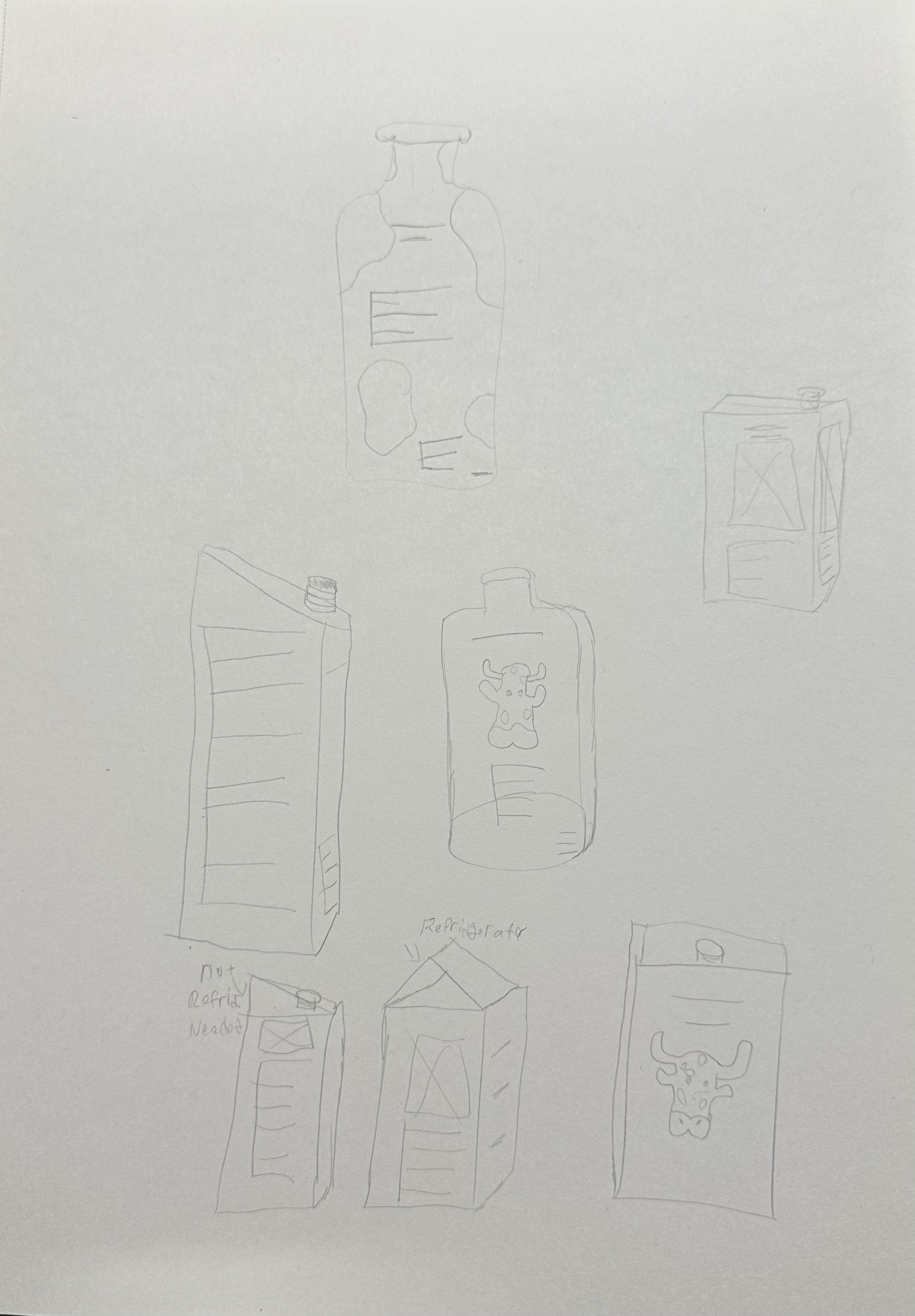
Beverage Container Sketches
The finished products together.


